Ranking South Carolina’s Best Under Armour Uniforms Before the Nike Era Begins
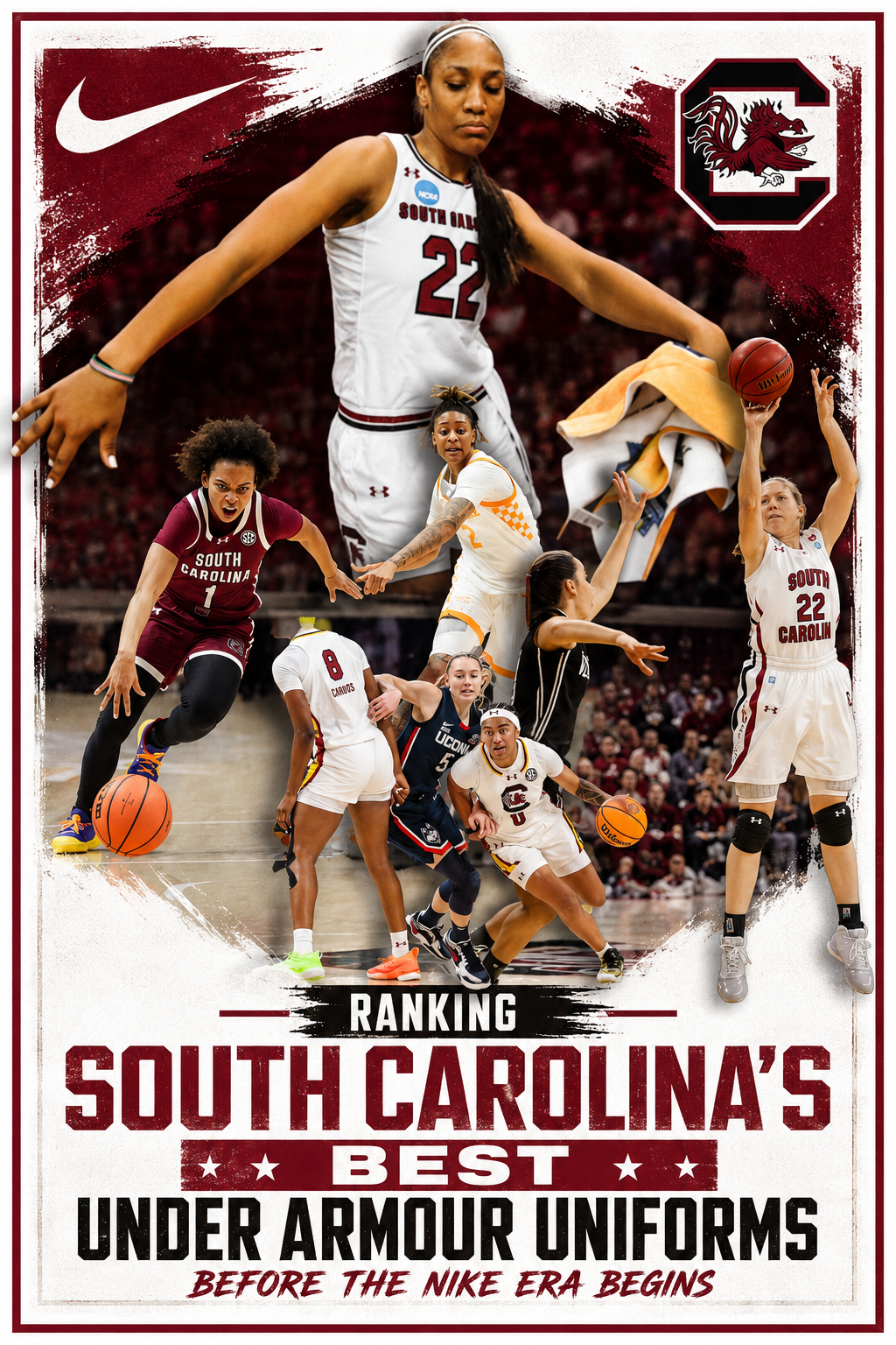
On July 1, South Carolina officially becomes a Nike school, closing the book on 17 seasons under Under Armour. Last week’s look back covered the program’s worst designs; this time, the focus shifts to the three uniform sets that got it right — plus one near-miss that’s worth remembering.
The Foundation: Classic White Design (2009-2013)
South Carolina’s first Under Armour set wasn’t flashy, but it didn’t need to be. The look relied on simple, well-balanced typography: “South” arched over the numbers on the front, “Carolina” running straight underneath, and “Gamecocks” spelled out vertically down the shorts — a detail made possible by the long-shorts era, which left enough room to fit the whole word.
Analytically, this set succeeds because it understood restraint. The white colorway, trimmed in garnet and black, didn’t try to overload the jersey with branding or texture. It let the school’s identity speak through clean lines rather than busy design choices, which is exactly why it still holds up as “clean and classic.”
The Iconic Years: White Tail Feather Side Panels (2013-2019)
The 2013 redesign arrived at a pivotal moment, just ahead of South Carolina’s first SEC championship, and it raised the program’s visual identity along with its on-court success. The biggest structural change consolidated “South Carolina” into a single line above the numbers, while subtle sublimated tail feathers were added to the side panels.
The analysis here is less about the design details themselves and more about timing and context. Those tail feathers and the condensed wordmark could be tough to make out up close, but they translated well on television — and they happened to be on display during the program’s first national championship celebration. That moment cemented the jersey’s legacy: it wasn’t necessarily the most intricate design, but it became iconic because of when South Carolina wore it, cutting down the nets in front of a national audience.
The Bold Reinvention: Double-Decker Garnet (2023)
By 2023, Under Armour shifted away from a decade of single-line or split wordmarks and introduced a double-decker “South Carolina” stacked above the numbers, with “USC” and “WBB” added to the shorts’ side panels.
This redesign stands out for taking a real risk. Rather than recycling prior formulas, Under Armour built something distinct to South Carolina’s identity. The garnet version, in particular, made every design element pop more than the white or black alternatives. The drawback, from an evaluative standpoint, isn’t the design itself but its scarcity — South Carolina rarely wore it, limiting how much this set could become part of the program’s visual legacy.
Special Mention: The “Cocky” Alternates
The “Cocky” alternates deserve recognition for solving a real design problem: fitting “South Carolina” or “Gamecocks” onto a basketball jersey is difficult, so Under Armour stripped away the text entirely and centered the look on a single Block C. Paired with swooping side panels, the result was crisp and visually sharp.
So why does this set fall short of the top three? The color choice undermines it. Garnet paired with yellow strays from South Carolina’s actual school colors, and from the back or side, the jersey could easily be mistaken for Southern Cal, Iowa State, or any number of programs that aren’t South Carolina. A uniform built around colors that don’t belong to the school can’t reasonably crack a “best of” list, no matter how clean the underlying design is — which is exactly why it earned a special mention rather than a top spot.